ARTSTOR
Challenge
Designing the IA of a digital information environment (e.g. website, online store, Intranet, mobile/ desktop app. etc.) in our chosen domain, aimed at addressing requirements.
Target Users
Students, Beginners, Artists
My Information Architecture project was based on creating a website that helps users learn more about art supplies. Buying art supplies can be an intimidating process as there are too many options to choose from. Being a Visual Artist myself, I used to have a very hard time finding the right materials and mediums and this is what led me to choose this topic.
User Research
In order to understand the parameters of my domain model and the purpose my platform will serve, I conducted five interviews; two beginner, an art student and two established artists as my domain experts. The interviews helped me in getting a systematic and structured data. Using the data collected from the user research and reviewing existing comparable websites to crosscheck if my interviewees have missed any variables, I constructed a rough draft with pen and paper to get a better understanding through a visual representation and to eliminate any overlapping concepts.
Domain Model
From interview responses, I was able to list the important common entities, which helped me to construct the domain model. I then established the common touch points that very few respondents purchase their supplies online as the website mostly lacked product information such as product details, pictorial references, product recommendation and prices. All five participants mentioned, when making an artwork they take inspiration from various sources. This steered me to incorporate an inspiration page within the platform where users could learn new art techniques and art movements via detailed videos. The inspiration page will also provide information of the art materials used with pictures and links to the single product pages and provide recommendations based on the user’s searches within the same platform, enhancing their overall experience. I then refined the concept and constructed my domain model in order to ensure the goals and pain points are catered to and the concepts reflect on the domain model in an effective manner. As for the design specifics I used circles to represent nodes as they easily connect with links, look clean and are easy to understand.

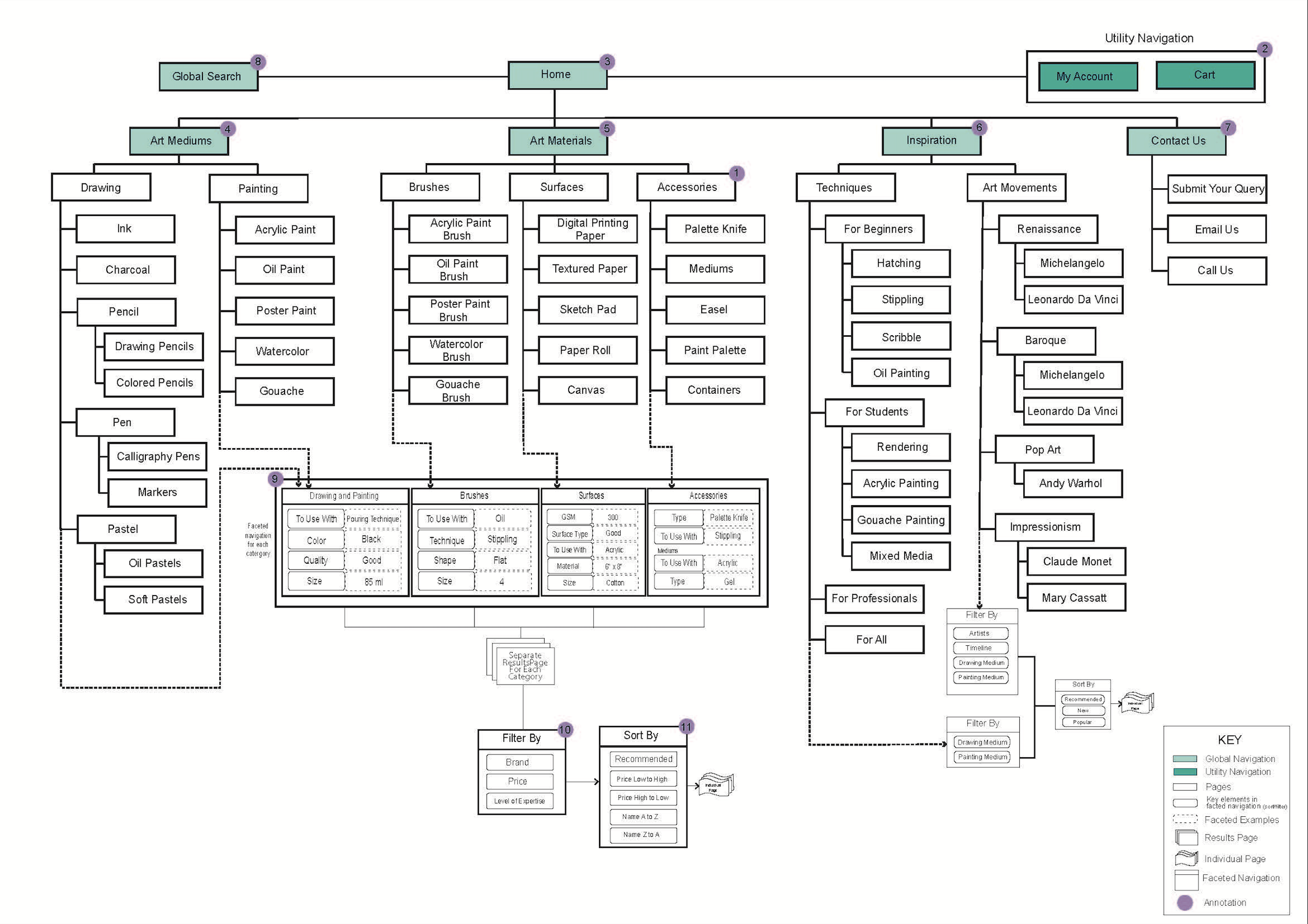
Sitemap
The design of the sitemap was heavily dependent on my user research, domain model and competitive analysis of similar websites, which helped me in refining the structure of my wireframes. Using Optimal Workshop, an online software tool, I conducted an open card sort with 15 participants, which helped me in labelling, categorising and subcategorising the vast product range. The sitemap had been designed based on three key points: helping the user find the specific art supply, helping them understand what the art supply is used for and with and helping them gain more knowledge about it.
User Journey
I based my user journey on a findability task which demonstrates how to find Oil Paint that best suits your needs as a user. The user journey illustrates the three alternate options (1) in order to search for oil paint for beginners from the website; via the global search, via the product search or via the inspiration page. Giving these options to the users would help them in searching for the oil paint, also enabling them to come across new products via the ‘related products’ on the specific product page. Having the option to view inspiration for beginners or otherwise, it would filter the content as per the user’s expertise beforehand. By the help of filtering (2) and refining the results (3) for each category, it will help the user avoid unnecessary navigation and find the right product quicker. Further to the process of the user journey, I added the user’s thoughts throughout the journey to understand the user’s action.

Wireframes
To visually represent the user journey, I designed four wireframes to demonstrate the main functionality of my domain, navigation and page layout. The sitemap helped me in determining the placement of the content on the wireframes and how the journey should navigate through the website.
W1 - I started the design process from the product category page, since most people spend most of their time on the product category page or the product listing page. The page contains the main product heading in the banner with a brief description of the product category. The page also includes a global navigation with the main categories listed and the global search bar available to users throughout their journey. The product categories on the global navigation has a drop down menu listing all the product listings, leading to individual pages for each product. I have used breadcrumbs as a tool for user to navigate their location on the website, supporting their way finding. My account and the cart, utility navigation functions, are displayed on the top right side of the page due to its minimal functionality throughout the journey.
W2 - The second wireframe demonstrates the product listing of ‘Oil Paints’ to view the range of individual products in the listing. A brief description of the medium is displayed right next to the banner so it catches the user’s eye as they land on the page. The design approach of this wireframe is derived mainly from the user research with more pictorial representations of the products. A vertical facet, helping users in narrowing their search as per their needs, is placed on the left side with a scroll option in some options to enable the users to filter their search in order find what they are looking for with ease, filtering the content as per their requirements.

W3 - The third wireframe, an individual product page, is designed to meet the user’s need. It incorporates pictorial representation of the chosen product with product specifications on the right side and product details listed as well. Next to the product specifications, the website ensures to inform the user whether the product is in stock or not. The page has an ‘Add to Cart’ option if the user wants to continue browsing and/or shopping or the ‘Buy Now’ option, which will directly take the user to the cart page to finish their purchase and ending their journey. The page also features more information on the product, videos and pictures of the product in use and recommendation of related products.
W4 - The last page of the wireframe design is the technique page under ‘Inspiration’ for ‘Beginners’. This page demonstrates a user wanting to learn a new technique ‘Stippling’ which is taught via a video available to view on the website. The. page further describes a little more about the technique through a brief description, the materials used in the technique, with links to those products, other techniques videos that the user might be interested in based on their search and their last watched videos if they wish to watch them again.

Evaluation
For evaluation purposes, I used two approaches; self-critical analysis and user testing with two participants to test the wireframes and report any issues they come across in the journey. While conducting a critical self-analysis, I was having difficulty navigating through page w2 with the sheer number of images on one page, six product images in one row. Due to the large number of products displayed on the page, the images and description appeared to be too small, which I could see being a reason of user frustration. I therefore made the relevant changes to page w2. The second issue that could possibly arise is the need to move pages to navigate through the large number on products on w2, which would not be very user friendly. To fix the potential issue, I added a load more option at the bottom of the page, which would load more products on the same page so the user can just easily keep scrolling through. I then engaged the participants for evaluation. The participants were asked to learn an art technique and purchase the art materials used in the technique to make their artwork. The task would enable them to navigate through the website and they were requested to provide their feedback as they go through the journey. However, both the participants spoke highly of the visual representations and how the materials were listed, one of the participants reported that she could not find any student discounts, sales or bulk buy discounts on the website, which could be a driving factor for the website and attract more customers. The other user went on further to suggest that they could not find out information about the company or the links to their social media accounts. Upon conducting some secondary research, the ‘About Us’ page is crucial for the customers to build a relationship and connect with you. This helps in gaining customer’s trust and enhances their experience. Taking this valuable feedback, I will be adding an ‘About Us’ page on the website with links to the company’s social media accounts so the connection can be built with the users and incorporating discounts after negotiating with the suppliers once the website is live.
This project was awarded a distinction.